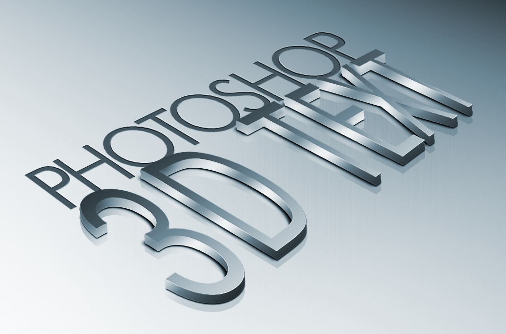
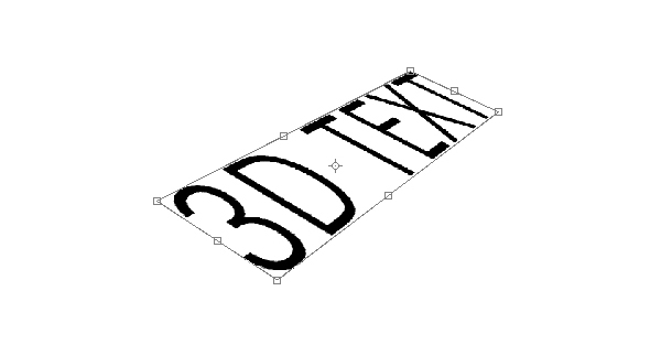
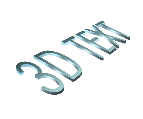
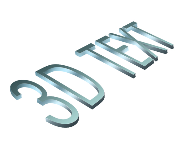
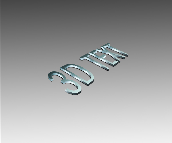
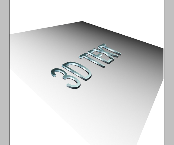
Final Image Preview
Let's take a look at the image we'll be creating. Want access to the full PSD files and downloadable copies of every tutorial, including this one? Join PSDTUTS PLUS for just $9/month. You can view the final image preview below or view a larger version here.
Step 1
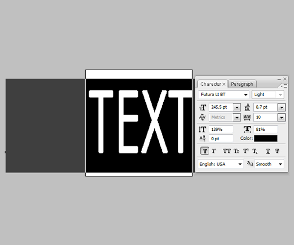
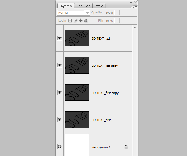
Let's start with a new document of 1500 pixel by 1500 pixel, and 300px/inch resolution. Create a new layer, name it "3D TEXT_first." Then grab the Type Tool (T) and type big letters of your desired text, in my case it's written as 3D TEXT. Also don't worry if your text goes out of canvas, it has to be very big. Because we're going to rasterize this layer and distort it in the next step.
Step 2
So now, right-click on the "3D TEXT_first" layer and select Rasterize Type. Then use Edit > Transform > Distort and create a nice perspective to our text by dragging the corners. Make sure your text is way smaller. This way you won't lose its quality and the text won't get blurry.
Tip: If you fail by distorting, and some text edges look fuzzy, use Filter > Sharpen > Unsharp Mask, and increase the Amount.
Step 3
Now that the text is way smaller and has a nice perspective, create a duplicate (Command + J) of this text layer and name it "3D TEXT_last." Switch to Move Tool (V) and use keyboard arrows to position the "3D TEXT_last" layer a bit above the "3D TEXT_first" layer. In my case this was 16 pixels up and 2 pixels right.
Step 4
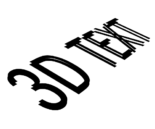
Create duplicates (Command + J) of both text layers and position them as you see in the image below. Make sure you have exactly the same order as shown, as it's important!
Step 5
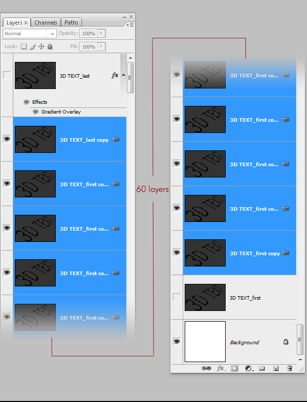
Now turn off "3D TEXT_first" and "3D TEXT_last" layers. Select the "3D TEXT_first copy" layer and make around 60 copies (Command + J). Now, select "3D TEXT_last copy", go all the way down to the bottom of Layers Palette, hold Shift and left-click on the first "3D TEXT_first copy" layer - this should select all 60 layers. Next right-click on those layers and select Link Layers.
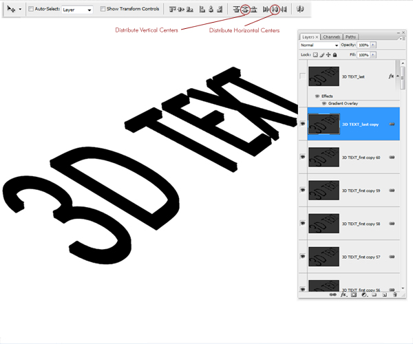
Step 6
Switch to Move Tool (V), select "3D TEXT_last copy" layer. Go to the upper toolbar of the move tool. Click on Distribute Vertical Centers and Distribute Horizontal Centers. Then notice that our letters were perfectly distributed creating a nice 3D shape. Next, select all linked layers and merge (Command + E). Name this layer "3D TEXT_merged."
Step 7
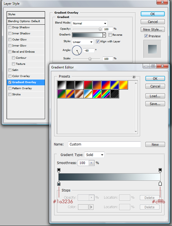
Go to Layers Palette, turn on "3D TEXT_last" and open this layer's Blending Options. Apply a Gradient Overlay from #1a3236 to #cffffb. As for setting the Angle, try to make this gradient look darker on the top of letters, and lighter on the bottom of them.
Step 8
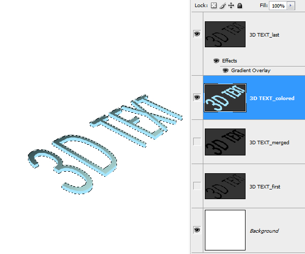
In the Layers Palette select "3D TEXT_merged," turn it off, then hold Alt and left-click on this layer's thumbnail to load the selection. Make a new layer, name it "3D TEXT_colored" and fill it with #a6e6fe. Deselect (Command + D).
Step 9
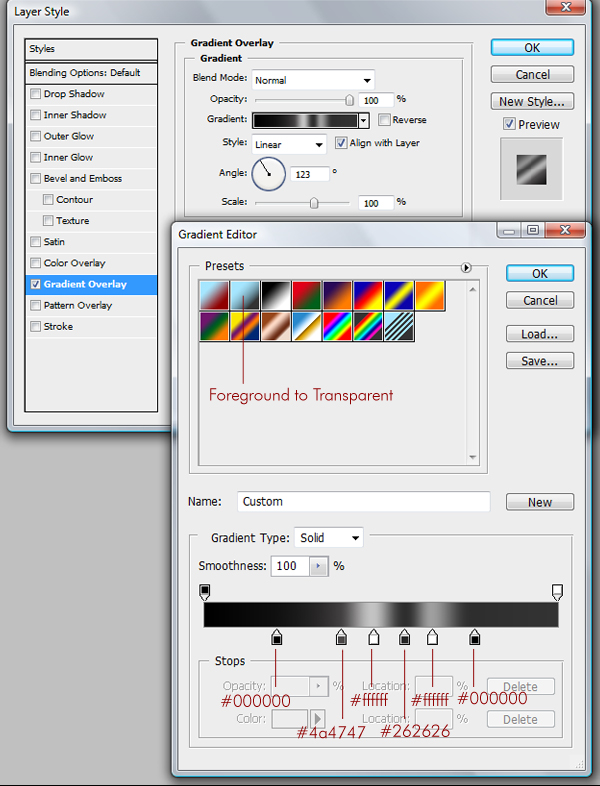
Now go to "3D TEXT_colored" layer's Blending Options. Select Gradient Overlay. Make sure you select the second preset in the Gradient Editor, that is Foreground to Transparent, and then set the color values starting as: #000000, #4a4747, #ffffff, #262626, #ffffff, and #000000. Next, depending on which direction your text is going, the Angle will be different. So in my case I set the Angle to 123, and as you can see the gradient goes through the center of the whole text. So that will be our lighting.
Step 10
Some spots and the top of the letters look too bright, so we need to create just a touch of shadow in places indicated below. So hold Alt, left-click on the "3D TEXT_colored" layer to load its selection, then create a new layer above the "3D TEXT_colored" layer, and name it "Shadows." Set your Foreground Color to #1a3236 or darker, then grab the Brush Tool (B), set Flow around 30%, Hardness to 0% and paint. Then Deselect (Command + D) once you're done.
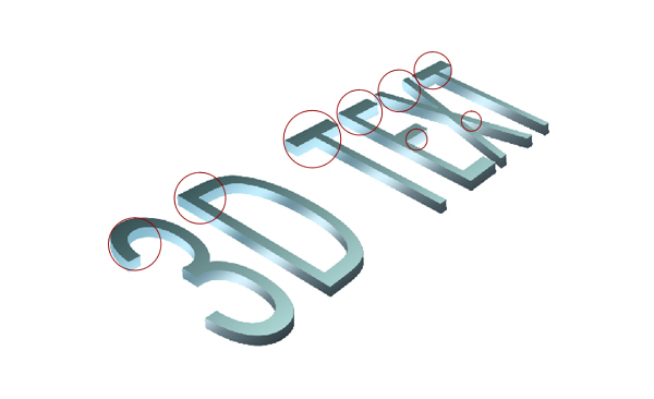
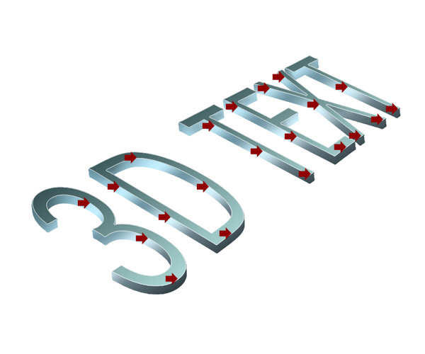
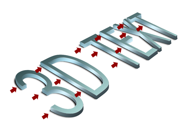
Step 11
Now let's start giving this text a quality look. Go to the Layers Palette, hold Alt and left-click on "3D TEXT last" layer thumbnail to load its selection. Then create a new layer above all layers, name it "Shining lines." Grab the Rectangular Marquee Tool (M), right-click on your image and select "Stroke." Set Width to 1 pixel, Color to white, and Location to Center. Grab a nice big brush with Hardness 0% and Flow around 30%. Then erase everything except places indicated with arrows. These arrows point to lights, and those pointed edges need some shine. So make sure you leave them untouched.
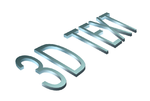
Step 12
When you're done erasing, create a duplicate of the "Shining lines" layer, lower its Opacity just a touch, and merge (Command + E) those two layers. You may switch for a moment to a black background to see if you did a good job with erasing, if not, make some further corrections. You should get something that looks similar to the image below.
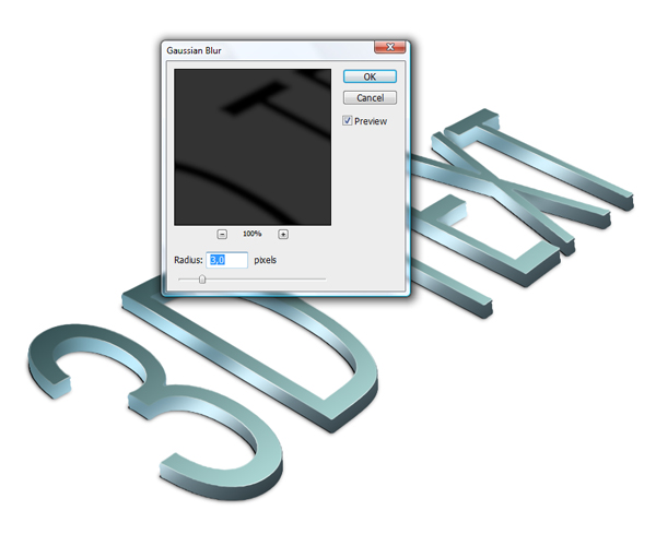
Step 13
Now go to the bottom of the Layers Palette, select and turn on "3D TEXT first" layer, rename it to "Bottom shadow 1." Make a duplicate of it (Command + J), name this copy "Bottom shadow 2." Now apply Filter > Blur > Gaussian Blur to the "Bottom shadow 2" layer, with Radius of 3 pixels.
Step 14
Switch to the Move Tool (V), and by hitting keyboard arrows move this blurred shadow 5 pixels to the left. You need to create an illusion that the curvy text lines drop more shadows inside. So we do not need some outside parts of this shadow. Grab the Brush Tool (B) and softly brush parts of the shadow shown below. Don't be to picky, there is no need to make an accurate erase. It's OK if you leave some gray shadow edges, like in the second image below.

Step 15
Now go back and apply Filter > Blue > Gaussian Blur to the "Bottom shadow 1" layer. Set the Radius just a little smaller, like 2 pixel. Next, switch to the Move Tool (V), and by hitting the keyboard arrows, position this shadow 2 pixels down, and 2 pixels to the right. Let it cover the whole space under the letters, and remember to keep the shadow edges very thin.

Step 16
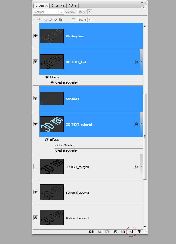
Great, we made our text really stand out. Next go to the Layers Palette, hold Command, left-click on the "Shining lines," "3D TEXT_last," "Shadows," and "3D TEXT_colored" layers. Now that you have selected them, drag these layers onto the Create a New Layer icon. Next, merge those copies (Command + E) and name this layer "Reflection." Place it above all layers and turn it off (it's important to turn it off, so do not skip this step).
Step 17
Now, turn off the "background" layer, or even delete it, we no longer need it. Go to Image > Merge Visible, name this merged layer "TEXT." Position it above the "Reflection" layer. As you can see we have two similar layers with a small difference, the "TEXT" layer has a drop shadow, and "Reflection" has no shadow. We will be working now with the "TEXT" layer so let the "Reflection" layer remain invisible.
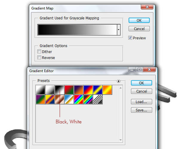
OK, let's give these letters a higher quality look. Select the "TEXT" layer, duplicate it (Command + J), and this should automatically be named "TEXT copy," leave it this way. Thenchange the "TEXT copy" layer Blending Mode to Overlay and Opacity to 63%. Next go to Edit > Adjustments > Gradient Map, and select the Black to White preset.
Step 18
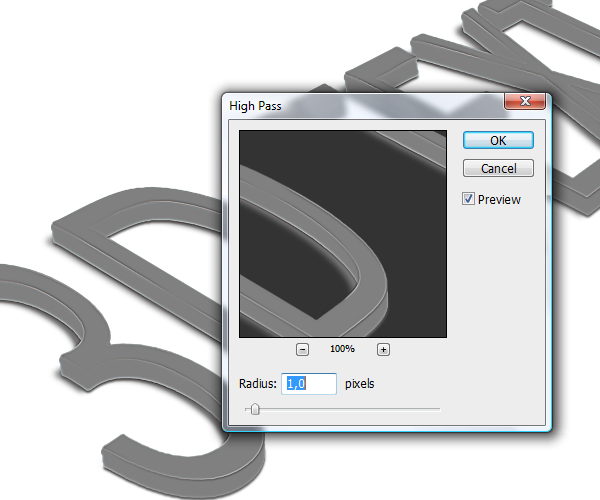
Next, make another duplicate (Command + J) of the "TEXT" layer, and position it above all layers. Name it "Sharp edges" and by the way change it's Blending Mode to Hard Light. Then go to Filter > Other > High Pass, set the Radius to 1 or 2 pixels. Lower this layer's Opacity around 60-70%.
Step 19
Create a new layer below all layers, name it "Surface," press D on the keyboard to set colors to default. Grab the Gradient Tool (G) and create a large gradient, through the whole image, from top to bottom. You can start it outside the canvas. Then go to Edit > Transform > Distort, and give this surface a touch of perspective. It doesn't have to be perfect. Because when you're done, select the Crop Tool (C), and crop the image nicely to get rid of the surface edges.
Step 20
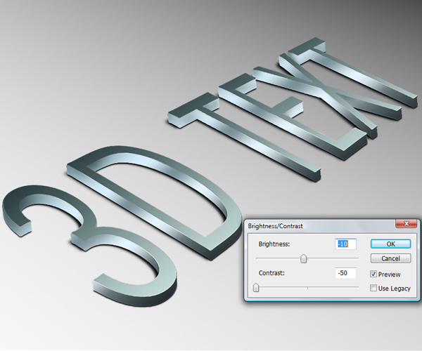
As I was looking to this image I thought the text is a little to bright for me, so next thing I did, was select the "TEXT" layer and apply Image > Adjustments > Brightness/Contrast. I lowered the Contrast all the way down.
Step 21
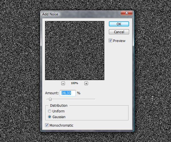
Next, go to the very bottom of the Layers Palette, and create new layer above the "Surface" layer, then name it "Glass". Grab the Paint Bucket Tool (G), fill this layer with color #3f3f3f. Then apply Filter > Noise > Add Noise, set the Amount to 28%, Distribution to Gaussian, and leave the Monochromatic option checked.
Step 22
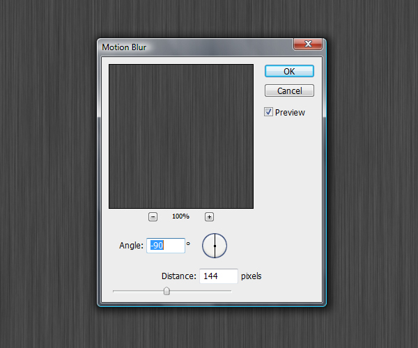
Now, select Filter > Blur > Motion Blur, set the Angle to -90, and Distance to 144 pixels. Change this layer's Blending Mode to Overlay, and set the Opacity to 50%. Grab the Brush Tool (B), then with a very nice soft brush of Hardness 0% and Flow around 20%, start erasing some spots of this blurred noise. Next erase places around the text to get a little of the glassy depth of the surface.
Step 23
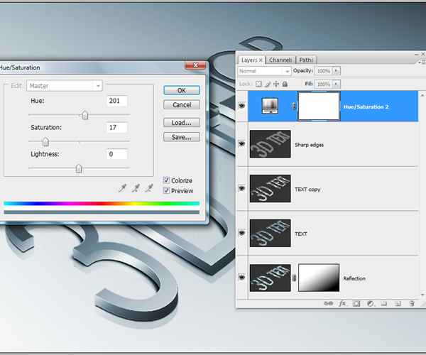
In the end, I decided to colorize this whole image. If you want to get the same final color effect, go to Layers Palette and add an Adjustment Layer on the top of all layers. Pick Hue/Saturation. Make sure you have the Colorize option checked. Then set Hue to 201, and Saturation to 17.
Next, select the "Reflection" layer, turn it on. Lower its Opacity to 20-30%, switch to the Move Tool (V), and by hitting the keyboard arrows, position it a few pixels down to make a nice reflection. Then you can apply a Layer Mask and softly erase some of the reflection bottom.
Conclusion
That's pretty much it, here is our quality 3D text, simply made in Photoshop. If you want to add some flat text to this image, make sure it's going towards the perspective. Also, try to discover your own use for this 3D typography by experimenting with colors and lights. You can get many cool, various results.
Thanks for reading the tutorial, I really enjoyed making it. Hope you've learned something new. You can view the final image below or view a larger version here.
Copyright by : psd tuts+